
Hey there! Have you ever been on your phone, trying to look at a website, and everything is just… wrong? The words are too small. The button is tinier than a ladybug. You have to pinch and zoom just to read anything.
Frustrating, right?
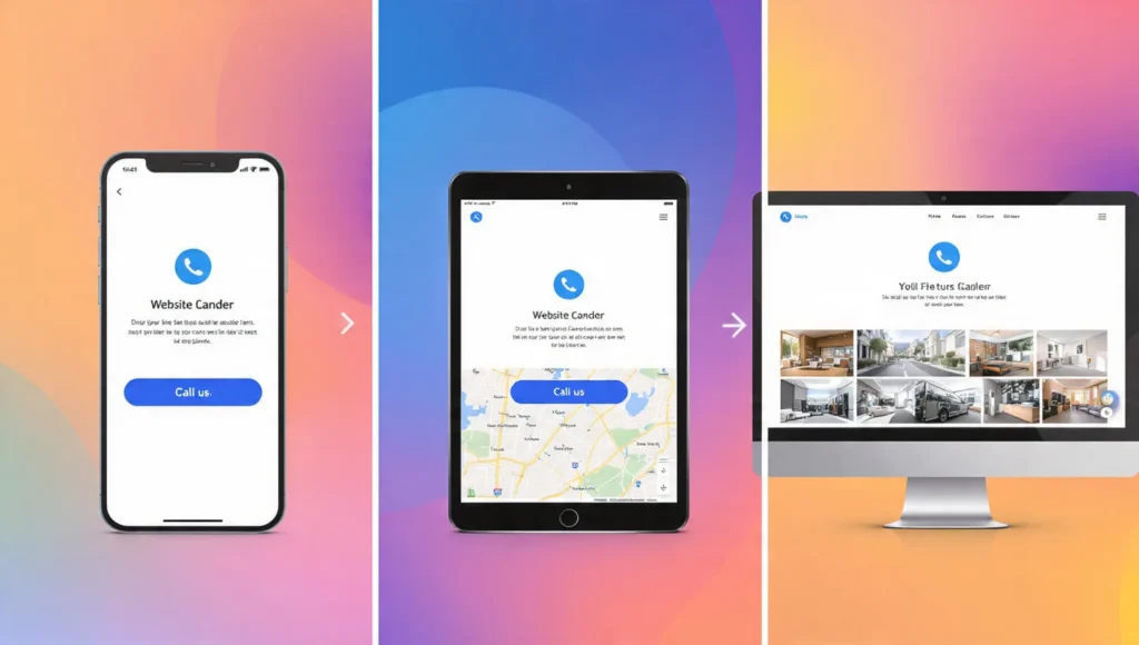
Now, think of a website that works perfectly. On your big computer screen. On your tablet. On your little phone. Everything just fits. The pictures are the right size. The text is easy to read. You can tap buttons with your thumb.
That magic is called Responsive Web Design. And it’s not really magic—it’s just good, smart planning.
This guide is all about the responsive web design best practices. Think of them as simple rules, like a recipe. Follow these rules, and you can make a website that looks great for everyone, no matter what device they use.
No confusing tech talk. Just clear, simple ideas. Let’s make the web a friendlier place, one screen at a time.
Part 1: The Core Mindset – It Starts with Thinking Differently
Before we talk about code or pictures, we need the right mindset. This is the most important of all responsive web design best practices.
Principle 1: Mobile-First is Friend-First
In the old days, people made websites for big computers first. Then they tried to squish them onto phones. That’s hard!
-
- The New Way: Start designing for the smallest screen first (the phone). This makes you focus on the most important stuff. What does someone really need to see or do right away? Then, as the screen gets bigger (tablet, computer), you add more.
- Example: Imagine a pizza shop website. On a phone, you just need the phone number, address, and a “View Menu” button. That’s it! On a big computer, you might also show a big photo of the dining room and the weekly specials on the side.
Principle 2: Content is a Liquid, Not a Rock
Think of your website content (words, pictures) like water. If you pour water from a cup into a bowl, it fills the new shape. Your website should do that.
-
- The Rule: Don’t force your content into a fixed, rigid box. Let it flow and rearrange to fit the space it’s given.
- What Happens: On a computer, your text might be in three columns. On a tablet, it becomes two columns. On a phone, all the text stacks into one, easy-to-read column.
Principle 3: The User’s Thumb is Your Boss
People use fingers and thumbs on phones, not a precise mouse cursor.
-
- Best Practice: Make every button and link big enough to tap easily. Leave plenty of space between clickable things so people don’t tap the wrong one.
- The Test: Can you tap it easily with your thumb while holding your phone? If not, make it bigger!
Part 2: The Layout – Building a Flexible Foundation
This is about how everything is arranged on the page. A good layout is the skeleton of your responsive site.
Principle 4: Use Flexible Grids
Imagine your page is divided into invisible columns. On a big screen, you might use 12 columns. A headline could take up all 12. A sidebar might take 3, and an article takes 9.
-
-
On a Small Screen: Those same pieces don’t use columns anymore. They just take up 100% of the width and stack on top of each other. The sidebar moves below the article. This is a flexible grid in action.
-
Principle 5: Embrace Flexible Images
This is a key responsive web design best practice. A giant, beautiful photo made for a computer will take forever to load on a phone and break the layout.
-
-
The Simple Fix: Tell images to never be wider than their container. Use one simple line of code:
max-width: 100%;. This means, “Hey image, you can be as big as the space allows, but never bigger.” It will shrink perfectly on a small screen.
-
Principle 6: Use CSS Media Queries (Your Design’s Superpower)
This is the secret sauce. A “media query” is just a little instruction you can give. It says, “If the screen is smaller than 768 pixels wide, then use this different style.”
-
-
Real-World Example: “If the screen is phone-sized, hide this big background video and change the menu into a hamburger icon (the three lines).”
-
Part 3: The Components – Making Each Piece Responsive
Now, let’s look at common pieces of a website and how to make them behave.
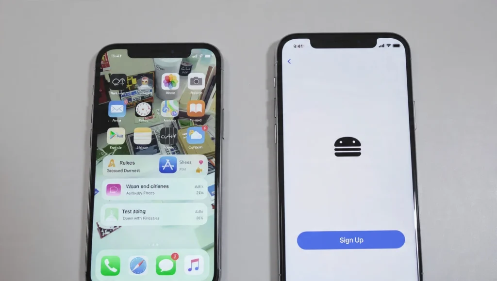
Principle 7: The Navigation Menu Must Transform
A big menu with 10 items across the top will turn into a messy soup on a phone.
-
-
Best Practice Solution: Use a “hamburger menu” (☰) for phones. When tapped, it slides out or drops down a neat list. This saves tons of space and is what users expect.
-
Principle 8: Typography That Reads Easy
Tiny text is the enemy of good design.
-
-
What to Do: Use relative units for font size (like
remorem), not fixed pixels. This lets the text scale based on the user’s settings. Also, make sure your “line height” (space between lines of text) is generous on phones for easier reading.
-
Principle 9: Buttons and Forms Need Room to Breathe
A skinny little “Submit” button is hard to hit on a phone.
-
-
The Fix: Make form fields and buttons large and block-shaped on small screens. Let them take up the full width. This gives users a big, easy target.
-
Principle 10: Show or Hide Content Wisely
Sometimes, you have extra content that’s nice on a big screen but just gets in the way on a phone.
-
-
Smart Move: You can conditionally hide some elements on small screens. Maybe you hide a complex sidebar widget or a secondary promotional banner. Keep the focus on the main goal.
-
Part 4: Performance – Fast is a Feature
A responsive site that’s slow is a bad responsive site. Speed is part of the user experience.
Principle 11: Optimize and Resize Your Images
This is the biggest performance tip. Don’t send a 2000-pixel-wide image to a phone that only needs a 400-pixel-wide image.
-
-
How to Do It: Use tools or website features that create multiple sizes of the same image. Then, let the browser download the size that’s right for its screen. This makes pages load much faster.
-
Principle 12: Keep it Simple
Every fancy animation, custom font, and giant video background makes your site slower.
-
-
The Practice: Ask yourself for every element: “Is this necessary?” Simplify your design. Use fewer decorative elements. This makes your site faster and often cleaner on mobile.
-
Principle 13: Test on Real (Slow) Connections
Don’t just test your site on your fast office Wi-Fi. Use your phone on a 3G/4G connection. Feel how long it takes to load. This will make you care about image size and simplicity.
Part 5: The Finishing Touches – Details Matter
These final principles are about polish and making it feel perfect.
Principle 14: Never, Ever Use Horizontal Scroll
If a user has to swipe left and right to read a sentence, you have failed. This is rule #1. All vertical scrolling is fine. Horizontal scrolling is almost always bad.
Principle 15: Check Touch Targets
Remember Principle 3? Go back and measure. Buttons and links should be at least 44×44 pixels on a phone screen. This gives the thumb a good target.
Principle 16: Test, Test, and Test Again
This is the final, essential responsive web design best practice.
-
-
How to Test: Don’t just trust the preview on your computer. Look at your site on:
- Your own phone and tablet.
- An iPhone and an Android phone (they can be different).
- A very old computer if you can.
- Ask friends and family to try it on their devices.
-
A Simple Comparison: The Old Way vs. The Responsive Way
| Feature | The Old Way (Fixed Design) | The Responsive Way (Best Practice) | Why It’s Better |
|---|---|---|---|
| Layout | A rigid, pixel-perfect width. | A flexible, fluid grid. | Fits any screen perfectly. |
| Images | One huge size for all devices. | Multiple, optimized sizes. | Loads fast and looks sharp everywhere. |
| Navigation | Same complex menu everywhere. | Transforms (e.g., to a hamburger menu on mobile). | Easy to use on any device. |
| User Goal | Make it look identical everywhere. | Make it work perfectly everywhere. | Focuses on the user’s experience, not just looks. |
Your “Get Started” Action Plan: 5 Simple Steps
Ready to make something responsive? Start here.
- Step 1: Adopt the Mobile-First Mindset. Grab a piece of paper. Sketch what your website needs on a phone screen only. Just the bare essentials. This is your new starting point.
- Step 2: Add the Magic Viewport Tag. In the
<head>of your HTML, put this line:<meta name="viewport" content="width=device-width, initial-scale=1.0">. This one line tells phones to use their real width. It’s the most important single line of code for responsiveness. - Step 3: Make Your Images Flexible. In your CSS file, add this rule:
img { max-width: 100%; height: auto; }. This instantly stops images from breaking your layout. - Step 4: Use Media Queries for Structure. Start with one media query for tablets. Write:
@media (min-width: 768px) { }. Inside those braces, put CSS that changes your one-column phone layout into two columns. - Step 5: Test Relentlessly. Open your site on your phone right now. Resize your browser window on your computer. See what breaks. Fix it. This is the real work.
Common Responsive Design Mistakes to Avoid
- Hiding Important Content on Mobile. Don’t just hide things because it’s hard. If it’s important for a desktop user, it’s important for a mobile user. Find a way to show it.
- Forgetting About Landscape Mode. People turn their phones sideways! Check how your site looks in both portrait and landscape.
- Using “Device-Specific” Designs. Don’t design for “the iPhone 12.” Design for screen sizes. There are too many devices to keep up with.
- Ignoring Performance. A beautiful, responsive site that takes 10 seconds to load is useless. Always think about speed.
- Making Tap Targets Too Small. That tiny “Next” link might work with a mouse. On a touchscreen, it’s infuriating. Bigger is better.
- Not Testing on Real Devices. The preview tool in your browser is helpful, but it’s not perfect. Nothing beats testing on a real, physical phone.
Bonus Tip: Think “Accessibility” from the Start
Responsive design isn’t just about screen size. It’s also about making your site usable for everyone, including people who use screen readers or navigate with a keyboard. Using proper HTML tags (like <header>, <nav>, <button>), adding alt text to images, and ensuring good color contrast are responsive web design best practices for humanity. A site that’s accessible is a site that’s more responsive to human needs.
Conclusion
So, what are the responsive web design best practices really about?
They’re not a list of chores. They’re a promise.
A promise to your visitor that says, “No matter how you come to me—on a giant monitor, a laptop, a tablet, or the phone in your hand—I will welcome you. I will be easy to use. I will respect your time and your needs.”
It starts with thinking “mobile-first.” It grows with flexible grids and images. It’s polished with perfect touch targets. And it’s proven with endless testing.
The web is no longer just on a desk. It’s everywhere. By following these simple principles, you’re not just building a website. You’re building a good experience for every single person who visits.
Now, go make something that works beautifully, everywhere.