Conversion Optimization
Learning

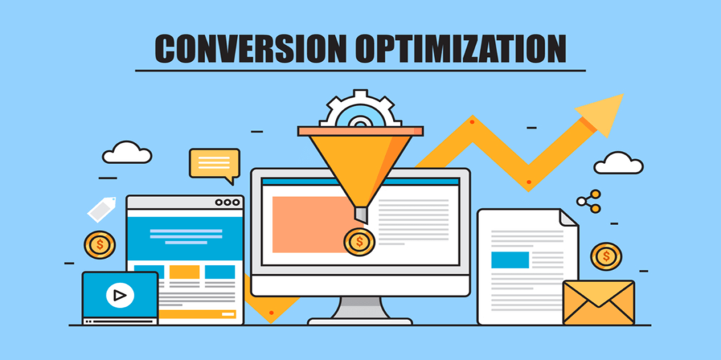
Conversion Optimization: 7 Website Design Secrets for Success

Introduction A website is more than just an online presence—it’s a powerful tool that should convert visitors into customers. If your site isn’t designed with conversion optimization in mind, you could be losing valuable leads and sales. So, what makes a high-converting website? It’s a combination of speed, user experience, strong CTAs, and trust-building elements. In this guide, we’ll cover seven essential website design secrets that will help you maximize conversions and grow your business. 1. Lightning-Fast Loading Speed Speed is non-negotiable when it comes to website performance. Studies show that if a page takes more than three seconds to load, over 50% of visitors will leave. How to Improve Speed: ✅ Compress and optimize images✅ Use a content delivery network (CDN)✅ Minimize scripts, plugins, and redirects Example: Amazon found that a 100-millisecond delay in load time reduced sales by 1%. Speed directly affects revenue! 2. Mobile-First Design Over 50% of web traffic comes from mobile devices. If your website isn’t optimized for mobile users, you’re losing potential customers. Best Practices for Mobile Optimization: ✅ Use a responsive design that adapts to all screen sizes✅ Ensure text is easy to read and buttons are finger-friendly✅ Test your website on multiple devices for a seamless experience Google also prioritizes mobile-friendly websites in search rankings, making mobile optimization essential for SEO and conversions. 3. Clear and Compelling Call-to-Action (CTA) A strong CTA guides visitors toward taking action—whether it’s purchasing a product, signing up for a newsletter, or booking a call. How to Make CTAs More Effective: ✅ Use action-driven language (e.g., “Get Started,” “Claim Your Free Trial”)✅ Make CTAs stand out with bold colors and contrasting backgrounds✅ Place CTAs above the fold and strategically throughout your page Example: Changing the CTA button color increased HubSpot’s conversion rate by 21%—small design changes can make a big impact! 4. Simple and Intuitive Navigation If visitors can’t find what they’re looking for quickly, they’ll leave. A cluttered or confusing navigation structure leads to high bounce rates. Navigation Best Practices: ✅ Limit your main menu to 5-7 items for clarity✅ Use breadcrumb navigation to improve the user journey✅ Keep the search bar visible and functional A well-structured website keeps users engaged longer, increasing the chances of conversion. 5. Engaging Visuals and High-Quality Content Users are more likely to trust and engage with websites that feature high-quality visuals and well-structured content. Tips for Engaging Content & Design: ✅ Use real, high-resolution images instead of generic stock photos✅ Break up long text with headings, bullet points, and white space✅ Add videos—they can boost conversions by 80%! People process visuals 60,000 times faster than text. A clean, visually appealing website builds trust and increases engagement. 6. Social Proof and Trust Signals Visitors trust businesses with real customer feedback and security assurances. Without these, potential customers may hesitate to take action. How to Build Trust: ✅ Showcase customer testimonials and reviews prominently✅ Display trust badges (SSL certificates, payment security logos)✅ Highlight client logos, case studies, and media mentions Example: A BrightLocal study found that 92% of consumers trust online reviews as much as personal recommendations. Adding reviews can significantly boost conversions. 7. Continuous A/B Testing & Optimization A high-converting website is never static—it requires continuous testing and optimization. How to Improve Website Performance: ✅ A/B test different headlines, CTA colors, and layouts✅ Use heatmaps to analyze user behavior and improve weak areas✅ Monitor key metrics like bounce rate, conversion rate, and user flow Websites that regularly test and optimize see higher conversion rates over time. Never assume your current design is perfect—always experiment and improve! Conclusion A high-converting website isn’t just about aesthetics—it’s about conversion optimization. By focusing on: ✅ Speed for faster user experience✅ Mobile-friendliness to reach more visitors✅ Strong CTAs to guide users to action✅ Intuitive navigation for easy browsing✅ Engaging visuals and content for better user experience✅ Social proof and trust signals to boost credibility✅ Continuous testing and optimization for ongoing improvement …you can turn more visitors into customers and increase your revenue. What’s Next? Take a closer look at your website today. Are you implementing these conversion-boosting design elements? If not, start optimizing now and watch your conversions skyrocket! 🚀.https://byteminders.com/  

Website Development

Minimalist Design : The Best Way to Build 1-Page Websites

Introduction: Why Simplicity Wins Online In an era of shrinking attention spans and information overload, single-page websites are emerging as a powerful alternative to traditional multi-page sites. Rooted in minimalist design, they offer a sleek, focused, and user-friendly experience that aligns with modern browsing habits. Whether you’re a startup, freelancer, or business looking for a clean online presence, a 1-page website might be your best bet. But why are single-page websites gaining popularity? And when does “less” truly become “more”? Let’s explore the trend and uncover the power of minimalist web design.     The Rise of Single-Page Websites in the Digital Age 1. Fast Load Times and Seamless Navigation One of the biggest advantages of a single-page website is speed. With fewer resources to load, these sites typically perform much better than their multi-page counterparts. A fast website leads to: Improved user experience Lower bounce rates Higher search engine rankings (Google prioritizes speed) Additionally, simple, scroll-based navigation eliminates the need for users to click through multiple pages, creating a seamless and intuitive browsing experience. 2. Enhanced Mobile Experience With mobile traffic surpassing desktop usage, having a site optimized for mobile is non-negotiable. Minimalist design works exceptionally well on smaller screens, making single-page websites a go-to choice for businesses that prioritize mobile users. The ease of vertical scrolling aligns perfectly with how people naturally browse on smartphones. 3. Clear and Focused Messaging Traditional websites often suffer from clutter and excessive information, leading to decision fatigue for users. A 1-page website forces brands to distill their message into only the most essential content, leading to: Higher engagement rates Stronger calls to action (CTA) Better conversion rates By removing unnecessary distractions, minimalist websites ensure that visitors focus on what truly matters—whether it’s signing up for a service, making a purchase, or contacting the business. When Should You Use a 1-Page Website? While single-page websites are effective, they aren’t ideal for every business. Here are some situations where they shine: Personal Portfolios – Showcasing work, testimonials, and a call to action on a single page creates a strong impact. Freelancers & Consultants – A streamlined website communicates expertise without overwhelming potential clients. Event Pages & Product Launches – Keeping information concise ensures that visitors quickly grasp the event details or product benefits. Startups & Small Businesses – A clean, minimalist design helps emerging brands stand out and communicate value efficiently. For businesses requiring extensive content (e.g., blogs, e-commerce, or complex services), a multi-page website may be more suitable. SEO Benefits of Single-Page Websites 1. Better Page Authority With all content consolidated on a single URL, search engines can easily crawl and index the site. This can help improve rankings, as all backlinks and internal links contribute to one strong page rather than being spread thin over multiple pages. 2. Improved User Engagement Signals Search engines like Google factor in user engagement metrics such as time on page and bounce rate. A well-designed single-page website with a compelling minimalist design encourages users to scroll and engage with content rather than clicking away. 3. Easier Keyword Optimization A single-page website allows for strategic keyword placement without the risk of keyword cannibalization across multiple pages. To optimize effectively: Use primary keywords like “single-page website” and “minimalist design” naturally in headings and content. Include long-tail keywords to capture specific search queries. Optimize meta descriptions, alt text, and URLs to enhance visibility. Best Practices for Creating a High-Performing Single-Page Website 1. Prioritize a Clean, Minimalist Design Use ample white space to enhance readability. Keep color schemes simple and branding consistent. Choose high-quality visuals that complement, rather than clutter, the design. 2. Structure Content Strategically Break content into sections using distinct headers. Organize information in a logical flow: Introduction → Benefits → Testimonials → CTA. Use scroll-triggered animations to guide user attention without overwhelming them. 3. Optimize for SEO and Performance Incorporate SEO-friendly keywords like “single-page website” and “minimalist design” naturally. Use lightweight coding and image optimization to maintain fast load speeds. Implement schema markup to enhance search visibility. 4. Include a Strong Call to Action Since you have just one page, your CTA must be compelling. Whether it’s signing up, booking a consultation, or purchasing a product, make sure it stands out visually and is easy to act on. Conclusion: Less Is More, but Only When Done Right The growing popularity of single-page websites is a testament to the power of minimalist design. They offer speed, simplicity, and a seamless user experience—making them a great choice for businesses and individuals who want to make a lasting impression without unnecessary complexity. However, success lies in execution. By prioritizing clean design, strategic content placement, and performance optimization, you can create a 1-page website that not only looks stunning but also drives results.

Website Development

Responsive Design: 3-Step Guide to Bootstrap Web Development

Introduction In today’s digital world, having a responsive design is crucial. With mobile users surpassing desktop users, ensuring that your website looks great on all devices is a must. A responsive website adapts seamlessly to different screen sizes, providing a smooth user experience. Bootstrap, a powerful front-end framework, simplifies responsive design by providing a pre-built grid system and various UI components. Whether you’re a beginner or an experienced developer, Bootstrap helps create sleek, mobile-friendly websites with minimal effort. This 3-step Bootstrap tutorial will guide you through the process of building a responsive website effectively.     By following this guide, you’ll learn how to: Set up Bootstrap for your project Structure a responsive design layout Customize and refine the design for a better user experience Let’s dive in! If you’re interested in learning more about front-end development, check out our <a href=’/frontend-basics’>Frontend Basics Guide</a> Step 1: Setting Up Bootstrap Before you start building your responsive design, you need to integrate Bootstrap into your project. Here’s how: 1.1 Include Bootstrap via CDN The fastest way to start using Bootstrap is by linking it through a Content Delivery Network (CDN). Add the following lines inside your <head> section: <!DOCTYPE html> <html lang=”en”> <head> <meta charset=”UTF-8″> <meta name=”viewport” content=”width=device-width, initial-scale=1.0″> <title>My Responsive Design</title> <link rel=”#”> <script src=”#”></script> </head> <body> <!– Your content here –> </body> </html> 1.2 Download Bootstrap (Optional) If you prefer to work offline or need customization, download Bootstrap from getbootstrap.com and include the necessary files in your project. Step 2: Building a Responsive Layout With Bootstrap set up, you can now create a structured layout using its grid system for a responsive design. 2.1 Understanding the Bootstrap Grid System Bootstrap’s grid system is flexible and responsive, using rows and columns. It follows a 12-column layout, allowing you to design your website structure with ease. The grid system adjusts automatically based on screen size. 2.2 Creating a Basic Responsive Layout Let’s build a simple responsive webpage: <div class=”container”> <div class=”row”> <div class=”col-md-6 col-lg-4 bg-primary text-white p-3″>Column 1</div> <div class=”col-md-6 col-lg-4 bg-secondary text-white p-3″>Column 2</div> <div class=”col-md-12 col-lg-4 bg-success text-white p-3″>Column 3</div> </div> </div> 2.3 How It Works   container: Ensures the content is centered and provides a responsive design. row: Wraps columns and aligns them properly. col-md-6: Each column takes half the screen (6/12) on medium devices and one-third (4/12) on large screens. col-lg-4: On large screens, columns occupy one-third of the row. Step 3: Enhancing with Bootstrap Components Bootstrap offers built-in components that improve usability and responsive design. Here are a few essential ones: 3.1 Adding a Responsive Navigation Bar A responsive design requires a smooth navigation system. Bootstrap makes it easy: <nav class=”navbar navbar-expand-lg navbar-dark bg-dark”> <div class=”container-fluid”> <a class=”navbar-brand” href=”#”>My Responsive Design</a> <button class=”navbar-toggler” type=”button” data-bs-toggle=”collapse” data-bs-target=”#navbarNav”> <span class=”navbar-toggler-icon”></span> </button> <div class=”collapse navbar-collapse” id=”navbarNav”> <ul class=”navbar-nav”> <li class=”nav-item”><a class=”nav-link” href=”#”>Home</a></li> <li class=”nav-item”><a class=”nav-link” href=”#”>About</a></li> <li class=”nav-item”><a class=”nav-link” href=”#”>Contact</a></li> </ul> </div> </div> </nav> 3.2 Adding Responsive Buttons Bootstrap buttons adjust automatically based on screen size: <button class=”btn btn-primary”>Click Me</button> 3.3 Using Bootstrap Cards for a Responsive Layout Cards are great for a clean, structured design: <div class=”card” style=”width: 18rem;”> <img src=”image.jpg” class=”card-img-top” alt=”Responsive Design Example”> <div class=”card-body”> <h5 class=”card-title”>Card Title</h5> <p class=”card-text”>Some quick example text.</p> <a href=”#” class=”btn btn-primary”>Go somewhere</a> </div> </div> 3.4 Adding a Responsive Footer A responsive footer enhances user experience: <footer class=”bg-dark text-white text-center py-3 mt-4″> &copy; 2025 My Responsive Website. All rights reserved. </footer> Conclusion With just three simple steps, you can create a fully responsive design using Bootstrap. By integrating Bootstrap, structuring a responsive layout, and utilizing built-in components, you ensure your site looks great on all devices. To further enhance your website, explore Bootstrap utilities like forms, modals, and animations. Experiment with different Bootstrap classes to customize your design and improve user experience. Now that you have the basics, start implementing Bootstrap in your projects and create stunning, mobile-friendly websites. Happy coding!

Must-Know Frontend Javascript Framework for 2024: What’s New and Hot
Website Development

Must-Know Frontend Javascript Framework for 2024: What’s New and Hot – Copy

Introduction: In the dynamic world of web development, Frontend Javascript Framework are crucial for building modern, interactive user interfaces. As we step into 2024, it’s essential to be aware of the latest and most influential frameworks that are shaping the future of frontend development. This guide will spotlight the must-know frameworks and highlight what’s new and exciting in the realm of frontend JavaScript frameworks. React: The Evergreen Giant Overview Developed by Facebook, React is a leading library known for its component-based architecture and virtual DOM. It enables developers to build dynamic, high-performance user interfaces. What’s New in 2024 Introduction of React Server Components and Concurrent Mode for smoother performance. New tools like React Query and React Hook Form streamline data fetching and form handling. Developer Testimonial “React’s component-based approach and extensive ecosystem make it my go-to for creating complex applications. The recent updates have only improved its already impressive performance.” – Alex, Full-Stack Developer Use Cases Used by companies like Facebook, Instagram, and Airbnb. Offers flexibility and a robust ecosystem for various applications. Read more about react : https://www.w3schools.com/react/ Vue.js: The Progressive Frontend Javascript Framework Overview Created by Evan You, Vue.js is celebrated for its simplicity and ease of integration. Features a reactive data-binding system and a component-based architecture. What’s New in 2024 Vue 3 introduces the Composition API and improved TypeScript support. Enhanced Vue Devtools for a better development experience. Developer Testimonial “Vue’s intuitive design and progressive nature make it incredibly easy to adopt. The new features in Vue 3 have been game-changers for my projects.” – Jamie, Frontend Engineer Use Cases Employed by Alibaba and Xiaomi. Ideal for both small and large-scale applications. Angular: The Robust Powerhouse Overview Angular, developed by Google, is known for its comprehensive framework structure and built-in tools. It’s designed for creating complex, enterprise-level applications. What’s New in 2024 Updates in Angular CLI and the new Ivy rendering engine for faster builds and improved performance. Developer Testimonial “Angular’s extensive features and tooling are perfect for large enterprise applications. The latest updates have enhanced its efficiency and scalability.” – Morgan, Senior Developer Use Cases Adopted by Google, Microsoft, and IBM. Best suited for enterprise applications requiring a robust framework. Svelte: The Game-Changer Overview Svelte offers a unique approach by compiling components into highly efficient JavaScript at build time. This results in minimal runtime overhead and exceptional performance. What’s New in 2024 SvelteKit introduces powerful features like built-in routing and enhanced TypeScript support. Developer Testimonial “Svelte compile-time magic delivers performance that’s hard to match. SvelteKit’s new features have made it even more appealing for my projects.” – Riley, UI Developer Use Cases Gaining traction for its performance and simplicity in projects like the official Svelte website. Solid.js: The New Contender Overview Solid.js uses a fine-grained reactivity model and focuses on high performance. It compiles reactive primitives to efficient JavaScript. What’s New in 2024 Expanding ecosystem with new libraries and tools, showcasing impressive speed and minimal overhead. Developer Testimonial “Solid.js’s fine-grained reactivity and minimal runtime are impressive. It’s quickly becoming a favorite for high-performance applications.” – Taylor, Web Developer Use Cases Preferred for projects that prioritize performance and minimalism. Other Notable Mentions Preact A lightweight alternative to React, known for its performance and small bundle size. Ideal for projects needing efficiency without sacrificing functionality. Alpine.js Offers Vue.js-style declarative programming for simpler projects with a minimalistic approach. Qwik Focuses on instant loading and optimized performance, perfect for high-speed, interactive applications. Comparative Analysis Performance Compare how each frontend JavaScript framework handles updates and rendering. Learning Curve Evaluate the ease of learning and adoption for each framework. Community and Ecosystem Consider the support, libraries, and community activity around each framework. Conclusion In 2024, the landscape of frontend JavaScript frameworks is vibrant and diverse. Whether you’re interested in React’s extensive ecosystem, Vue’s simplicity, Angular’s robustness, Svelte’s performance, or Solid.js’s innovative approach, there’s a framework to suit every need. By exploring these frameworks, you can stay ahead of the curve and integrate the latest technologies into your projects. check our new blog :demo 1 FAQs 1. What is a frontend JavaScript framework? A library or set of libraries that helps developers build and manage the user interface and interactions of web applications. 2. Which frontend JavaScript framework is best for 2024? It depends on your needs: React: Flexible and ecosystem-rich. Vue.js: Simple and easy to integrate. Angular: Suitable for complex, enterprise-level applications. Svelte: Known for high performance with compile-time processing. Solid.js: Offers fine-grained reactivity and speed. 3. How do I choose the right frontend JavaScript framework? Consider the project requirements, learning curve, performance needs, and community support to find the best fit for your needs. 4. What are the key benefits of using React? Component-based architecture. Efficient updates with Virtual DOM. Extensive ecosystem and community support. 5. What sets Svelte apart from other frameworks? Svelte compiles components into efficient JavaScript at build time, resulting in minimal runtime overhead and faster performance.

Website Development

5 Must-Have WordPress Plugins to Instantly Boost Website Speed

Introduction Website speed optimization is crucial for a better user experience, higher SEO rankings, and increased conversions. A slow website frustrates visitors, leading to high bounce rates and lost revenue. Google considers website speed optimization an important ranking factor, making it essential for WordPress users to enhance their website’s loading time. WordPress, being one of the most popular CMS platforms, has several plugins that can boost website speed and enhance performance. In this article, we will explore five must-have WordPress plugins for website speed optimization that will help improve load time, reduce server requests, and optimize your site for better performance. 1. WP Rocket – The Best Caching Plugin for Website Speed Optimization WP Rocket is one of the most powerful and beginner-friendly caching plugins. Unlike other caching plugins, WP Rocket does not require technical knowledge and starts working immediately after activation. Key Features of WP Rocket: ✅ Page and Browser Caching – Stores static content, improving page speed.✅ Lazy Loading – Loads images/videos only when needed, reducing initial load time.✅ Minification & Concatenation – Compresses CSS, JavaScript, and HTML files.✅ Database Optimization – Removes unnecessary files and reduces database size.✅ CDN Support – Works seamlessly with Content Delivery Networks for faster global performance. 🔹 Pro Tip: Combine WP Rocket with a CDN like Cloudflare for even faster results! 2. W3 Total Cache – A Free Alternative for Speed Optimization W3 Total Cache is another powerful WordPress caching plugin that enhances performance by reducing server load. It offers advanced settings, making it ideal for developers and users looking for full control over caching. Key Features: ✅ Full-page caching to speed up content delivery.✅ CDN integration for optimized file loading.✅ Object caching to enhance database queries.✅ Browser caching to improve returning visitor experience.✅ Minification of CSS, JavaScript, and HTML. 🔹 Best For: Users who want granular control over caching and optimization settings. 3. Smush – Optimize Images for Faster Page Speed High-resolution images slow down websites. Smush is an image optimization plugin that compresses images without reducing quality. Key Features of Smush: ✅ Lossless compression – Reduces file size without affecting quality.✅ Bulk optimization – Optimize multiple images with one click.✅ Lazy loading – Delays image loading until they appear on the screen.✅ Auto-resizing – Adjusts images to fit optimal screen dimensions.✅ WebP Support – Converts images into WebP format for better compression. 🔹 Pro Tip: Use Smush along with a CDN for even better website speed optimization! 4. Autoptimize – Minify and Optimize Code for Faster Performance Autoptimize improves website speed by optimizing CSS, JavaScript, and HTML files. This reduces unnecessary code, making your website load faster. Key Features of Autoptimize: ✅ Minifies & combines CSS/JavaScript for fewer HTTP requests.✅ Optimizes Google Fonts to reduce render-blocking issues.✅ Defer JavaScript Loading to prioritize important content first.✅ Lazy loading for images and media.✅ Compatible with caching plugins for enhanced performance. 🔹 Pro Tip: Pair Autoptimize with WP Rocket for a complete speed optimization solution! 5. Perfmatters – Reduce Unnecessary WordPress Bloat Perfmatters is a lightweight performance plugin that disables unnecessary WordPress functions, reducing HTTP requests and improving load times. Key Features: ✅ Disables emojis, embeds, and REST API for a leaner website.✅ Reduces server requests to improve efficiency.✅ DNS prefetching for faster resource loading.✅ Database optimization to remove unnecessary clutter.✅ Works alongside other caching plugins for maximum speed boost. 🔹 Best For: Those who want to remove unnecessary WordPress bloat and optimize performance. Conclusion – Take Your Website Speed to the Next Level! A fast-loading website is essential for better SEO rankings, improved user engagement, and increased conversions. Website speed optimization is no longer optional—it’s a necessity in today’s digital landscape. By using the best WordPress plugins for website speed optimization, you can dramatically improve page speed and reduce load times. 🔹 Quick Recap:✅ WP Rocket – Best caching plugin for speed optimization.✅ W3 Total Cache – Free alternative for advanced caching.✅ Smush – Image optimization without losing quality.✅ Autoptimize – Minifies CSS, JavaScript, and HTML.✅ Perfmatters – Removes unnecessary WordPress bloat. ⚡ Final Tip: Combine caching, image compression, and code optimization plugins for maximum speed improvements.

Website Development

Customizing WordPress Themes Using the Customizer

Introduction The WordPress Theme Customizer allows you to make real-time changes to your website’s appearance and functionality without needing to write code. It is an intuitive interface designed to help you customize elements such as the site title, colors, fonts, and layouts. This guide will provide step-by-step instructions, along with screenshots, to help you customize your WordPress theme effectively. Step-by-Step Instructions Accessing the Theme Customizer Log in to your WordPress dashboard. Navigate to Appearance > Customize from the left-hand menu. This will open the WordPress Customizer interface. Screenshot: Exploring Customizer Options The Customizer displays a live preview of your site on the right and customization options on the left. Common Options Available Site Identity: Change the site title, tagline, and logo. Colors: Customize the theme’s color palette. Fonts: Choose font styles and sizes. Menus: Manage navigation menus. Widgets: Add or remove widgets in sidebars and footers. Screenshot: Making Customizations a. Changing the Site Identity In the Customizer menu, click Site Identity. Upload a new logo, adjust the tagline, or update the site title. Observe the changes in the live preview. Screenshot: ![Customizing Site Identity](attachment link or upload will go here) b. Modifying Colors Click Colors in the Customizer menu. Choose a new color scheme or customize individual elements like background or text colors. The live preview updates automatically. Screenshot: ![Customizing Colors](attachment link or upload will go here) c. Adjusting Fonts Select the Typography option (if available) or use the additional CSS option for detailed changes. Choose fonts and font sizes. Preview the changes. d. Publishing Your Changes Once satisfied with your customizations: Click the Publish button at the top of the Customizer interface. Your changes will now be live on your website. Conclusion The WordPress Theme Customizer is a powerful tool for designing a unique and visually appealing website. It empowers users to see real-time changes, ensuring that their design decisions align with their vision. By mastering the Customizer, you can enhance your site’s aesthetics and functionality effortlessly.

Website Development

Embedding Media: Images, Videos, and Audio in HTML

Introduction: In Website development, developer embedding media such as images, videos, and audio in html to enhances the user experience and makes the content more engaging. This document will explain how to embed these media types using HTML tags and provide step-by-step instructions with examples.   Step-by-Step Instructions:   1. Embedding Images: To add a Image in an HTML page, we use the <img> tag. Steps:-  Use the “<img>” tag with the “src” attribute to specify the image file/path.  Add the `alt` attribute to provide alternate text for the image when internet failed to load image.  We use attributes “width” and  “height” to set or define image dimensions or size. Code Example <img src=”Nature.jpg” alt=”Nature image” width=”#” height=”#”>   2. Embedding Videos: To Add a video in an HTML page, we use the <video> tag. Steps:- Use the “<video>” tag with the “controls” attribute to add playback controls(like Play, Pause & Volume). Add  “<source>” tags within the “<video>” tag to specify video files source and format (mp4). Code Example <video controls width=”400″>     <source src=”Nature.mp4″ type=”video/mp4″> </video>   3. Embedding Audio To add audio in an HTML page, by using the <audio> tag. Steps:-  Use the “<audio>” tag with the “controls” attribute to add playback controls(Play, Pause). Add  “<source>” tags within the “<audio>” tag to specify audio files Source and format (mp3) Code Example <audio controls>     <source src=”Nature.mp3″ type=”audio/mpeg”> </audio> Screenshots: Image Output: Conclusion: Embedding Image, Video and Audio in Html web page exhibits website more interactive or makes the content more engaging  and user friendly  by using image tage <img>, Video tag <video>  and  audio tage <audio>.

Business Growth Article

Top 10 Benefits of Cloud Computing for Business Efficiency

Introduction: Cloud Computing for Business Efficiency has revolutionized how companies operate, offering innovative solutions to improve scalability, reduce costs, and enhance productivity. But what exactly is cloud computing? In simple terms, it refers to the storage and access of data and applications over the internet instead of relying on local systems. This technology is now critical for businesses aiming to remain competitive in today’s fast-paced environment. Efficiency is vital in the modern marketplace. Companies leveraging cloud computing for business efficiency can streamline operations, reduce expenses, and boost productivity—key factors for thriving in a dynamic market. Let’s explore the top 10 ways cloud computing transforms business operations. 1. Cost Efficiency With cloud computing for business efficiency, businesses can eliminate high infrastructure costs by adopting services like AWS, Google Cloud, or Microsoft Azure. These providers offer a pay-as-you-go model, ensuring companies only pay for the resources they consume. Learn more about the pricing models of AWS. 2. Scalability and Flexibility A critical aspect of cloud computing for business efficiency is its ability to scale resources up or down seamlessly, depending on demand. For example, during peak times, businesses can increase server capacity without crashing operations. Discover how scalability is handled by Microsoft Azure. 3. Collaboration and Remote Work Cloud computing enhances collaboration and productivity by enabling real-time file sharing and communication through tools like Google Workspace, Slack, and Microsoft 365. Teams can work from anywhere, maintaining business efficiency and flexibility. Find tools to improve remote collaboration at Google Workspace. 4. Advanced Security Cloud computing for business efficiency ensures robust security features like encryption, multi-factor authentication (MFA), and disaster recovery solutions. Businesses can rest assured that their sensitive data is protected. Explore the best practices in cloud security with IBM. 5. Enhanced Performance and Velocity Cloud computing utilizes global data centers to deliver fast processing and minimal latency, ensuring superior performance for resource-intensive applications. This directly contributes to business efficiency by enabling seamless operations. Learn about how performance is enhanced using Google Cloud’s infrastructure. 6. Innovation Enablement By leveraging cloud computing for business efficiency, companies can accelerate innovation. Cloud platforms enable rapid application development and deployment, reducing the time from ideation to market entry. Explore how AWS supports innovation through AI and ML tools. 7. Simplified IT Management Cloud solutions automate routine IT processes, allowing teams to focus on strategic objectives. Centralized dashboards also provide a comprehensive view of resources and performance metrics, boosting overall business efficiency. Learn about simplified IT management with Salesforce. 8. Ecological Sustainability Moving to the cloud reduces hardware reliance, energy consumption, and e-waste, contributing to sustainability—a key focus in modern business practices. Understand how green initiatives are supported by Google’s Carbon Neutral Cloud. 9. Competitive Advantage Agility powered by cloud computing for business efficiency allows organizations to adapt quickly to changing market demands, staying ahead of competitors with real-time analytics and scalable resources. Stay competitive by using insights from Microsoft Power BI. 10. Enhanced Customer Experience With cloud-powered tools, businesses can provide 24/7 services, personalize customer interactions using analytics, and ensure fast service delivery, leading to improved customer satisfaction. Learn about creating a better customer experience with Salesforce CRM. Conclusion Embracing cloud computing for business efficiency is no longer optional—it’s essential. From cost reduction to scalability, collaboration, and sustainability, the benefits are clear. Businesses that adopt cloud computing today are better positioned to thrive in tomorrow’s competitive landscape.   FAQs What is the main benefit of cloud computing for business efficiency? It reduces upfront costs, improves scalability, and enhances overall productivity. How does cloud computing improve collaboration? By enabling real-time communication and file sharing, teams can work seamlessly from any location. Is cloud computing secure? Yes, it offers advanced encryption, frequent updates, and disaster recovery solutions.

Mastering JavaScript ES6: Key Feature and Real-Life Examples
Website Development

Mastering JavaScript ES6: Key Feature and Real-Life Examples

1. Introduction to JavaScript ES6: The New Era of Coding What is ES6? ES6, or ECMAScript 2015, is a major update to JavaScript that revolutionized coding with new features. Mastering JavaScript ES6 helps you write modern, efficient, and maintainable code. Why Upgrade to ES6? Upgrading to ES6 means adopting more concise syntax, better performance, and modern features, helping you stay competitive in the ever-evolving world of web development. 2. Understanding ES6 Syntax Changes The Evolution of JavaScript Syntax JavaScript syntax has transformed significantly with ES6, making it easier to use and understand. This evolution is crucial for anyone mastering JavaScript ES6. Key ES6 Syntax Enhancements With ES6, features like let and const for variable declaration, arrow functions, and template literals make coding faster, easier, and more intuitive. 3. Let and Const: Modern Variable Declarations Difference Between var, let, and const Understanding how let and const differ from var is essential for mastering JavaScript ES6. While let supports reassignment, const locks values, ensuring better code stability. Real-Life Use Cases of let and const Use let in loops or conditional statements where values change. Use const for unchanging data, such as configuration settings. 4. Arrow Functions: Streamlining Your Code Syntax and Benefits of Arrow Functions Arrow functions simplify syntax while maintaining the this context. This feature is a cornerstone of mastering JavaScript ES6 for modern coding practices. Examples of Arrow Functions in Action Traditional function: function add(a, b) { return a + b; }   Arrow function: const add = (a, b) => a + b; 5. Template Literals: Enhancing String Manipulation What Are Template Literals? Template literals, an essential part of mastering JavaScript ES6, allow you to create dynamic strings with embedded expressions. Practical Examples and Applications const name = ‘John’; const greeting = `Hello, ${name}!`; 6. Destructuring Assignment: Simplifying Data Extraction Introduction to Destructuring Destructuring makes data handling more efficient, a key step in mastering JavaScript ES6. Real-Life Examples with Arrays and Objects Extract values from arrays: const [a, b] = [1, 2]; Extract properties from objects: const { name, age } = { name: ‘Alice’, age: 25 }; 7. Default Parameters: Setting Function Defaults How Default Parameters Work Default parameters provide fallback values in functions, streamlining your code—a must-know feature for mastering JavaScript ES6. Examples and Use Cases function greet(name = ‘Guest’) { return `Hello, ${name}!`; } 8. Rest and Spread Operators: Handling Data Flexibly Understanding Rest and Spread Operators The rest operator collects multiple values into an array, while the spread operator spreads arrays into individual elements—essential for mastering JavaScript ES6. Practical Examples and Applications Rest operator: function sum(…nums) { return nums.reduce((a, b) => a + b); } Spread operator: const numbers = [1, 2, 3]; const moreNumbers = […numbers, 4, 5]; 9. Modules: Organizing and Reusing Code What Are ES6 Modules? Modules are integral to mastering JavaScript ES6, enabling better code organization and reusability. How to Import and Export Modules Export: export const pi = 3.14; Import: import { pi } from ‘./math.js’; 10. Promises and Async/Await: Asynchronous Programming Made Easy Introduction to Promises Promises simplify handling asynchronous tasks—a critical skill for mastering JavaScript ES6. Using Async/Await for Cleaner Code async function fetchData() { const response = await fetch(‘https://api.example.com/data’); const data = await response.json(); return data; } 11. Classes and Inheritance: Building Robust Object-Oriented Code Basics of ES6 Classes Classes introduce a simpler syntax for creating objects and implementing inheritance, a vital feature for mastering JavaScript ES6. Implementing Inheritance in JavaScript class Animal { constructor(name) { this.name = name; } } class Dog extends Animal { speak() { console.log(`${this.name} barks.`); } } 12. Sets and Maps: New Data Structures in ES6 Understanding Sets and Maps Sets store unique values, while maps hold key-value pairs—important tools when mastering JavaScript ES6. Real-Life Examples and Use Cases const uniqueNumbers = new Set([1, 2, 3, 3]); const userMap = new Map(); userMap.set(‘name’, ‘Alice’); Conclusion: Mastering ES6 for Modern JavaScript Development Mastering JavaScript ES6 involves leveraging its powerful features like let and const, arrow functions, template literals, and promises. These tools make coding faster, easier, and more efficient. Internal Link: External Link: Official ECMAScript Language Specification

Website Development

2024 WordPress Trends: What to Expect and Prepare For

Introduction: Navigating the 2024 WordPress Landscape Staying updated with WordPress Trends isn’t just a good idea—it’s essential. Here’s why: Competitive Edge: Keeping up ensures your sites remain modern and ahead of competitors. Improved User Experience: Leveraging trends improves usability and visitor engagement. Example: Imagine using outdated plugins that slow down your site while competitors leverage faster alternatives. Guess which site visitors will prefer? 1. The Rise of Headless WordPress: A Game-Changing Trend Headless WordPress is a buzzword in the WordPress Trends for 2024. But what does it mean? Flexibility: Use WordPress for content management while designing custom interfaces with React or Vue.js. Performance: Faster loading times with tailored data delivery. Challenges: It’s more complex and requires technical expertise. Example: A blog powered by WordPress can integrate React for a seamless and interactive user experience. 2. AI-Powered Features: A Top WordPress Trend AI is revolutionizing WordPress development. Key areas include: AI-Driven Plugins: Tools like RankMath improve SEO with AI-based suggestions. Personalized Experiences: Analyze user behavior to serve tailored content. Example: An AI chatbot on your WordPress site can handle queries 24/7, boosting customer satisfaction. 3. Block Editor Evolution: Enhanced Customization in 2024 Gutenberg continues to lead WordPress Trends with exciting updates: New Blocks: Pre-built blocks for complex layouts. Advanced Customization: Greater control over block appearances and functions. Example: Use the new gallery block for a visually stunning portfolio, complete with hover effects. 4. Responsive Design in 2024: A Must-Follow Trend           Responsive design remains critical in WordPress Trends for 2024. Mobile-First: Prioritize mobile layouts as over 50% of traffic is mobile. Cross-Device Compatibility: Ensure usability across all devices. Example: Implement media queries in CSS to optimize font sizes for different screen dimensions. 5. Performance Optimization: A Key Focus in WordPress Trends Fast-loading websites are central to the WordPress Trends for 2024. Lazy Loading: Load images only when visible. Caching: Use plugins like W3 Total Cache for faster page loads. Example: Photography websites can use lazy loading to avoid slowing down due to high-resolution images. 6. Security Enhancements in WordPress: A Growing Trend Stay ahead of evolving security threats with these practices: Regular Updates: Update WordPress core, themes, and plugins. Two-Factor Authentication: Add an extra layer of security. Example: 2FA ensures unauthorized users can’t access your WordPress site, even with a compromised password. 7. The Growth of eCommerce: WordPress Trends to Watch ECommerce is booming on WordPress, thanks to WooCommerce and plugins: Personalized Shopping: Suggest related products to enhance user experience. Advanced Tools: Track inventory, manage payments, and monitor data effortlessly. Example: Use AI-driven WooCommerce plugins to recommend accessories when a user adds items to their cart. 8. SEO Strategies in WordPress Trends for 2024 SEO continues to evolve, and WordPress Trends highlight: Core Web Vitals: Focus on speed, interactivity, and stability. Schema Markup: Use structured data for rich snippets. Example: Add schema markup to recipes for star ratings and cooking times in search results. 9. Accessibility: An Essential WordPress Trend for 2024 Accessibility is crucial in modern web development: WCAG Compliance: Make sites usable for people with disabilities. Accessibility Plugins: Use WP Accessibility to identify and fix issues. Example: Adding alt text ensures visually impaired users can understand images using screen readers. 10. Multilingual Features: Expanding WordPress Horizons Going global is easier with WordPress: Multilingual Plugins: Use tools like WPML or Polylang for translations. Localized Content: Tailor content to specific regions and cultures. Example: A travel blog can offer content in multiple languages, broadening its audience. Conclusion: Stay Ahead with 2024 WordPress Trends By leveraging these WordPress Trends, you’ll stay competitive and build high-performing websites. Whether through AI, responsive design, or eCommerce advancements, 2024 promises exciting opportunities for WordPress developers and users alike. Learn more about WCAG Compliance Guidelines for accessibility. FAQs 1. How can AI improve my WordPress site? AI enhances personalization, automates SEO, and provides advanced tools for better user experiences. 2. Why is responsive design still relevant in 2024? With most traffic coming from mobile devices, responsive design ensures seamless usability on all screen sizes. 3. What are the latest WordPress Trends for performance optimization? Lazy loading, caching, and lightweight themes significantly improve site speed and user experience. 4. What’s the role of SEO in WordPress Trends for 2024? Focus on Core Web Vitals, schema markup, and staying updated with search algorithm changes to rank higher. 5. How can I ensure my WordPress site is secure? Regular updates, two-factor authentication, and strong password policies are essential for robust security.

Scroll to Top